
Red. I know I have posted about this before. I have an unsteady history with the color. I often find it either elementary or overkill, cheap or bougie. Basically, I have trust issues with red. You see- it can be done SO right. In my mind that is the exception not the normal. Every time I expect a beautiful red, it often ends up wrong. I want a luxe Hong Kong red, or a deep rose red. I love to see it pop on fabric more than paint. I like a red lacquer, not a red paisley. I am very quirky with the color. I love it done right, rich, and perfectly popped!
Here is a little bit of winter red to help you navigate the winter blues.
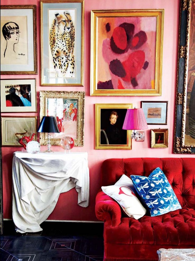
One of my favorites by the color wizard Miles Redd. Pink and Red looking so romantic together.
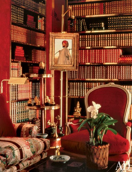
Brooke Astor’s chic library by Albert Hadley via AD.
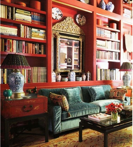
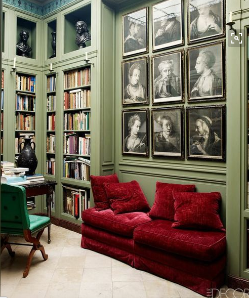
A chic red library by Beverly Field.
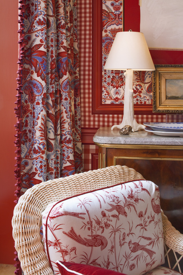
Mark D. Sikes Kips Bay Showhouse all decked in red.
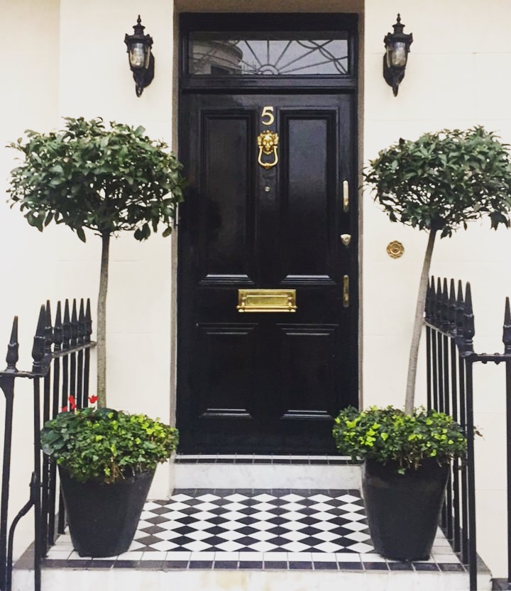
Again. Miles Redd knows how to pop the perfect amount of red.

Charlotte Moss also knows how to use a lovely red lamp shade in the most feminine way.
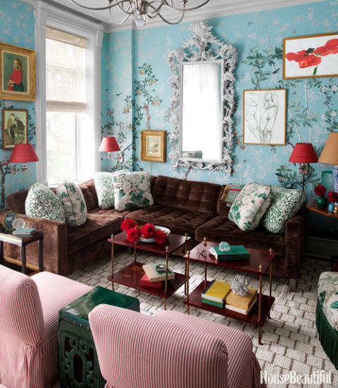
Red and green can make the perfect pair without making it feel like Christmas all year round. Then again, why is that a bad thing? Via Elle Decor